© Shehab Soliman
OLLKOM
Saudi Arabia
SMARTKOM
Creative Direction, Art Direction
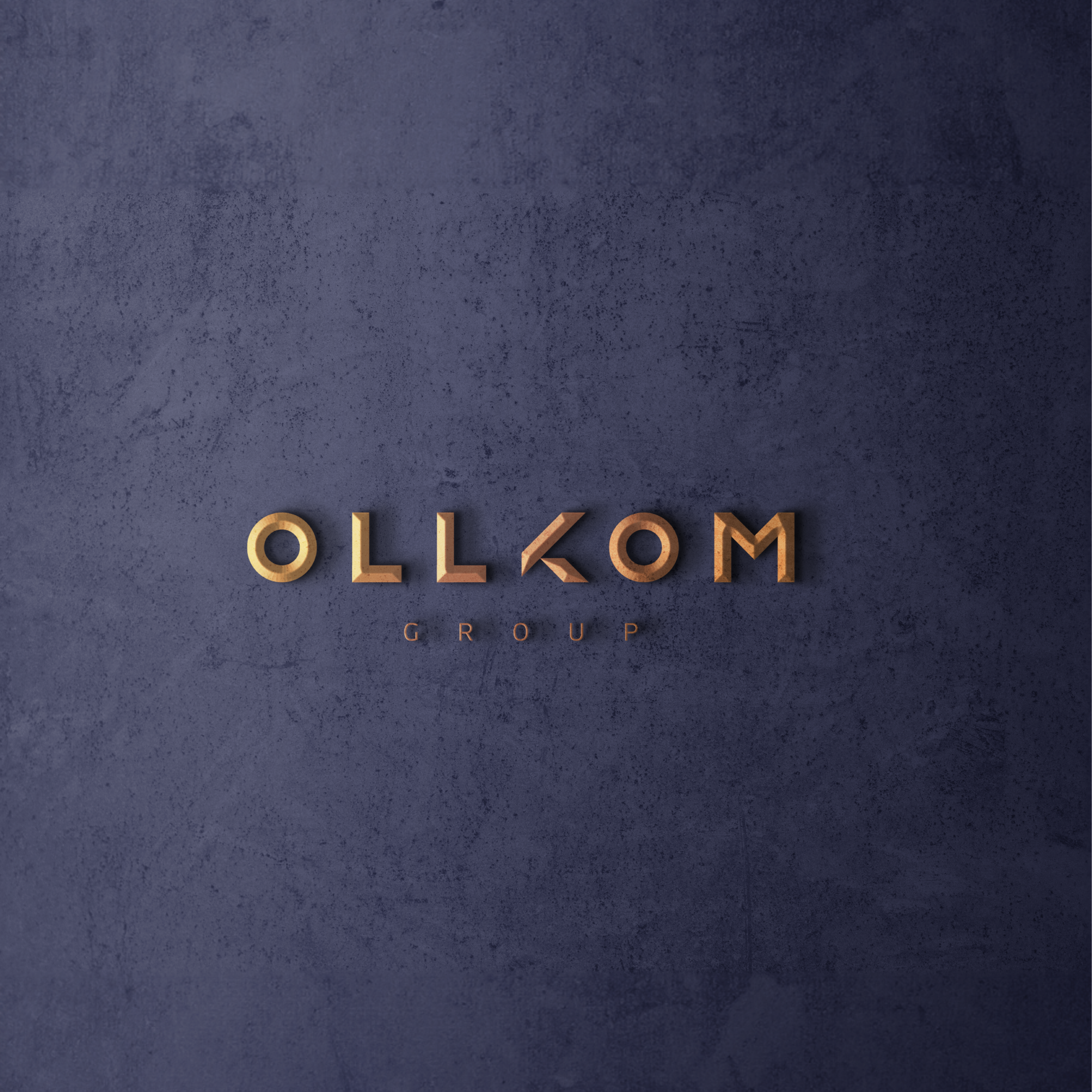
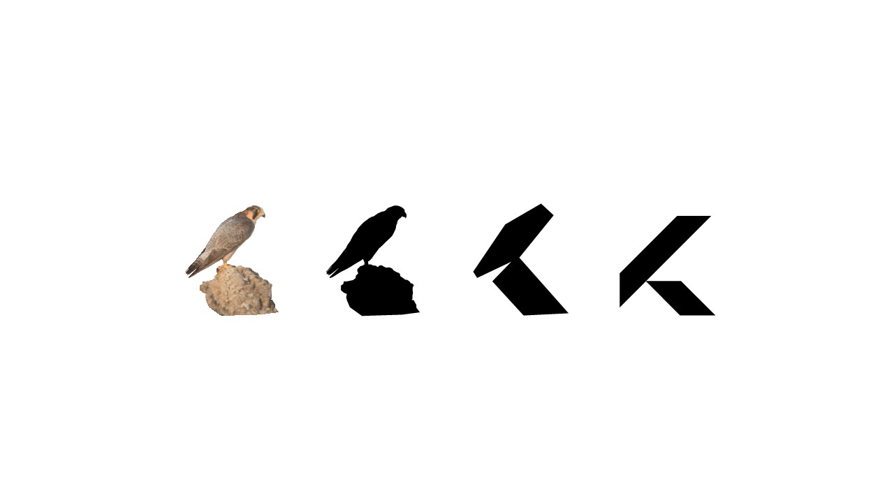
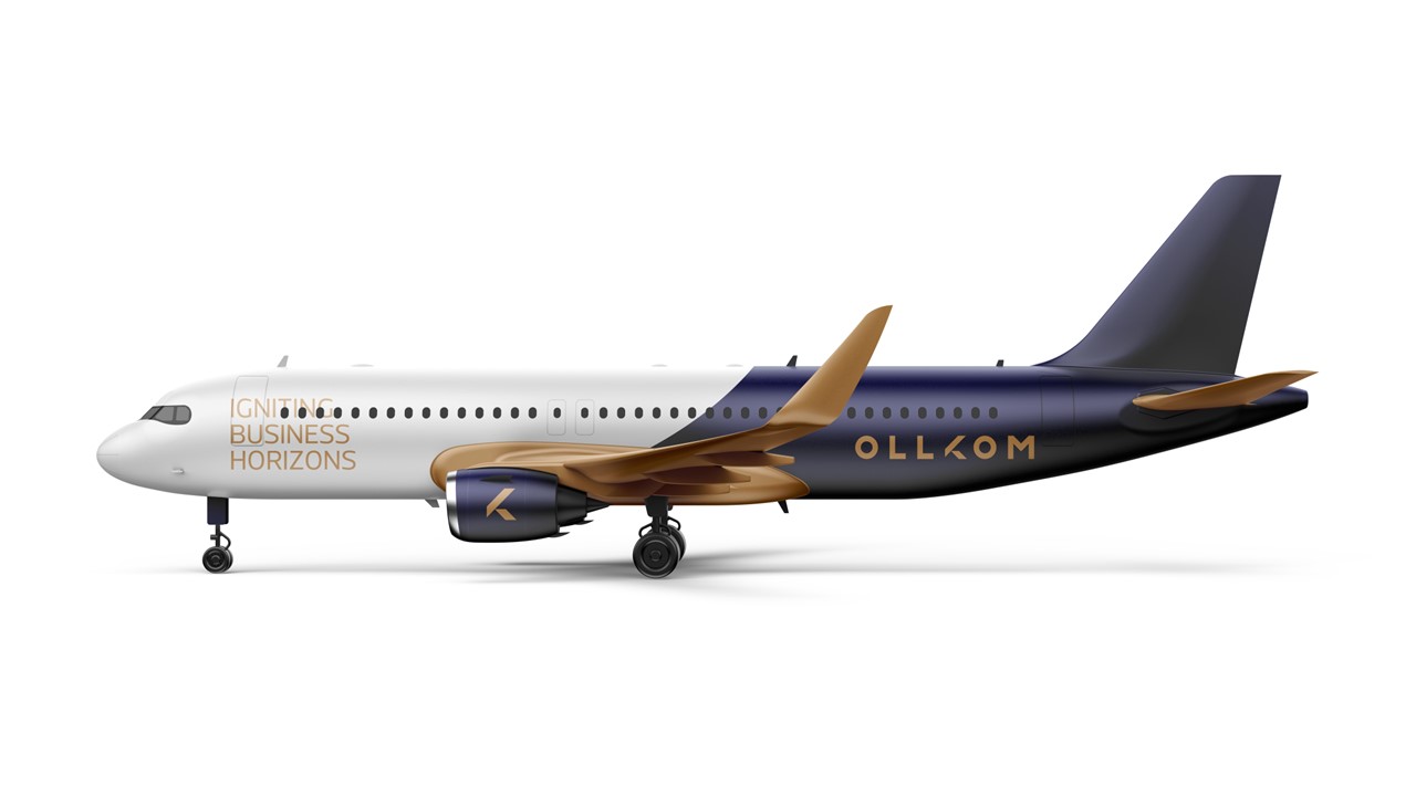
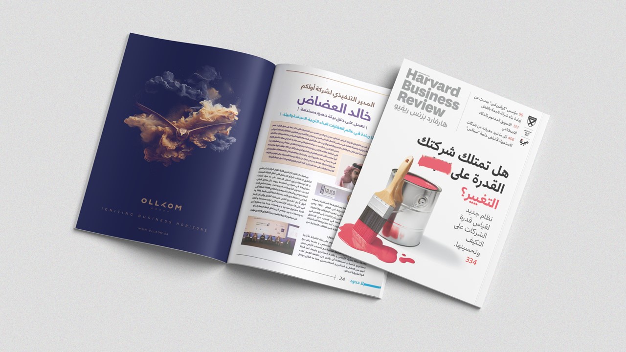
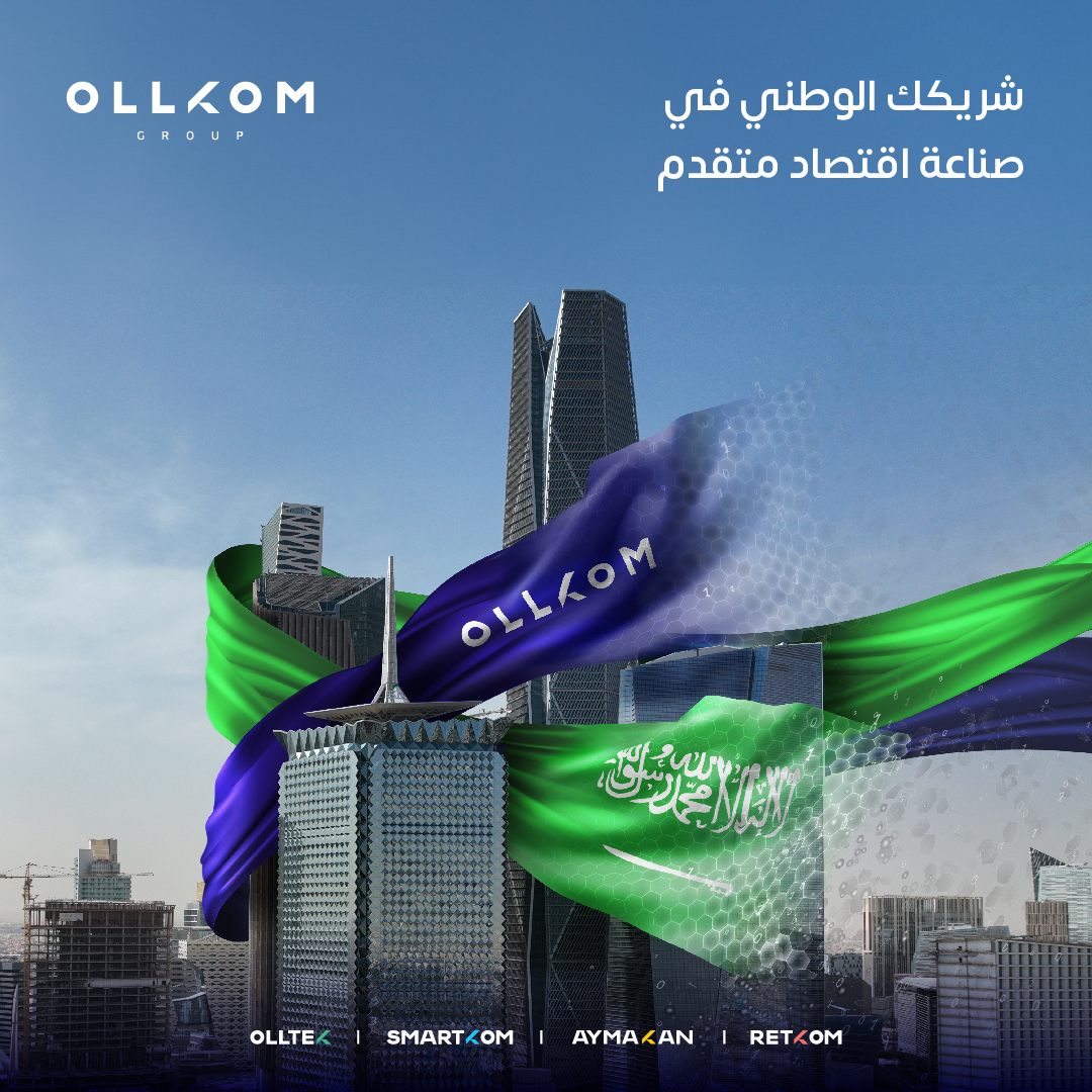
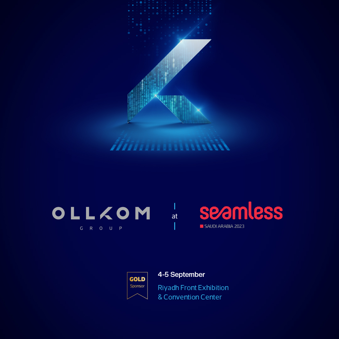
The new logo for OLLKOM Group draws inspiration from Saudi Arabian culture, specifically the art of falconry, to honor the brand's heritage. This cultural connection helps OLLKOM establish a unique and authentic identity that resonates with its local roots while presenting a distinguished image to a global audience. By integrating traditional elements into a modern design, the logo positions OLLKOM as a brand that values its origins and stands out in the international market.
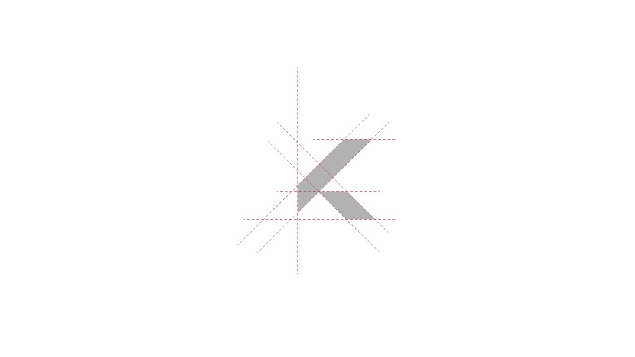
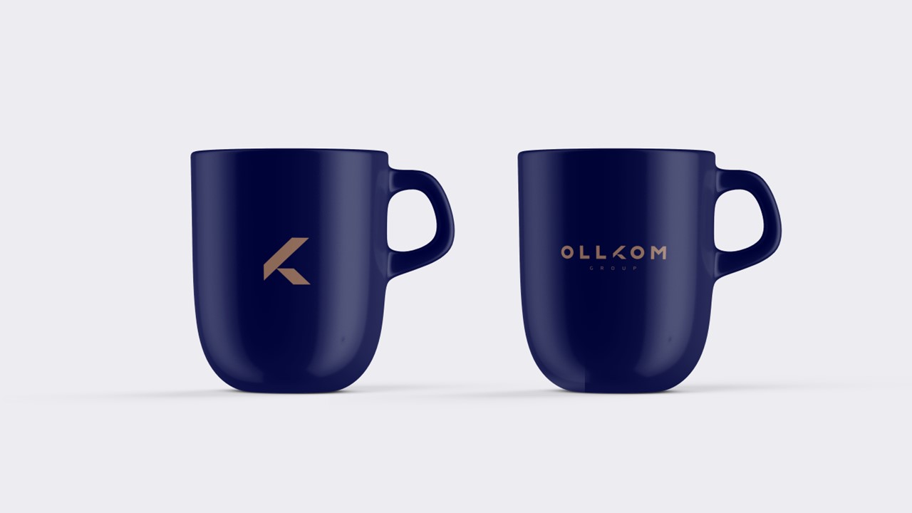
The falcon is incorporated into the "K" letter of the OLLKOM Group's revamped logo in an abstract form, serving as a powerful metaphor for the brand's goals. The falcon symbolizes agility, precision, and focus, qualities that mirror the group's core values and aspirations. This visual metaphor reflects OLLKOM Group's ability to identify opportunities, deliver efficient and accurate services, build strong client relationships, and overcome challenges. By associating these traits with the falcon, the logo communicates the brand's dedication to excellence, innovation, and global service standards.
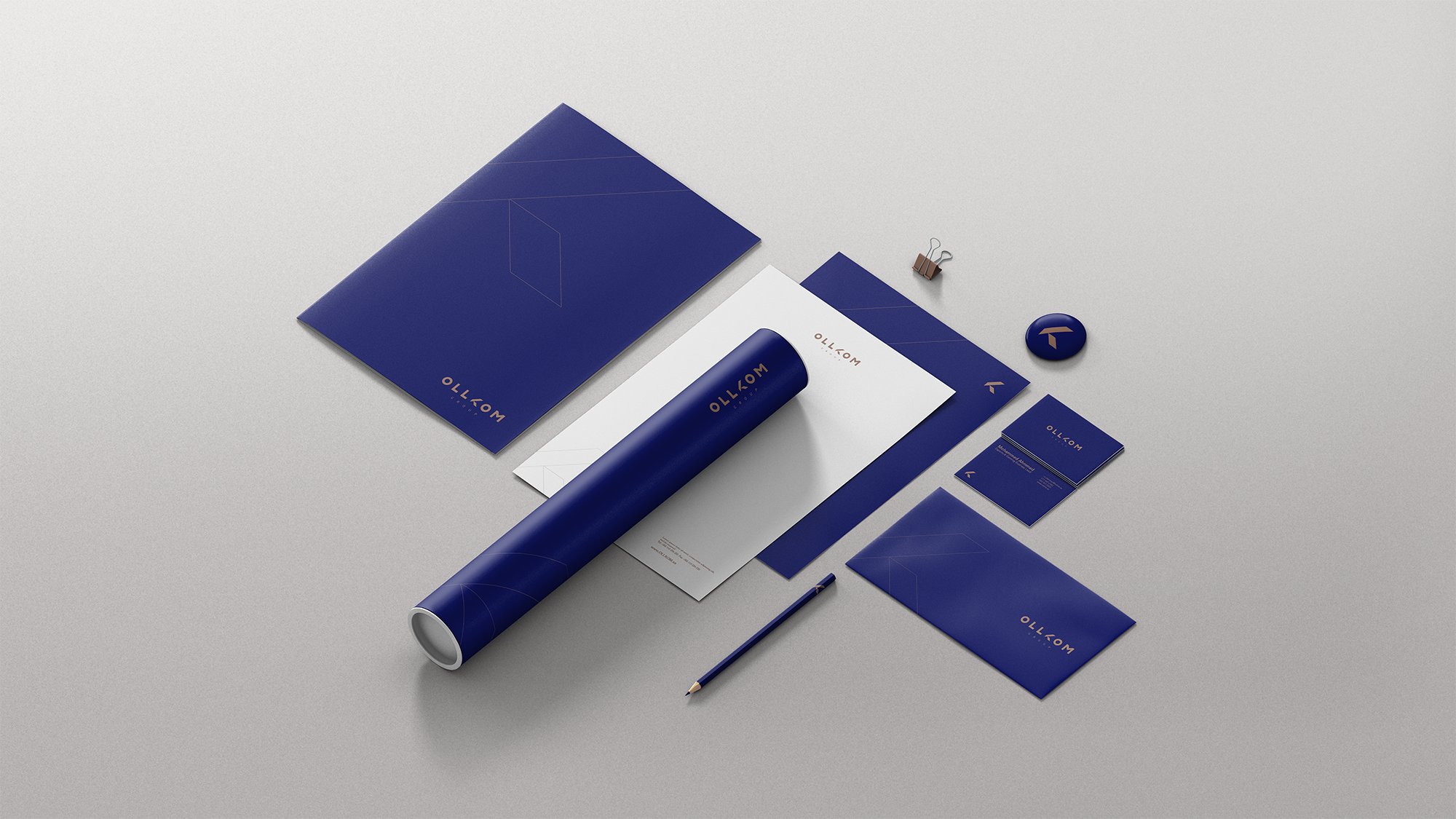
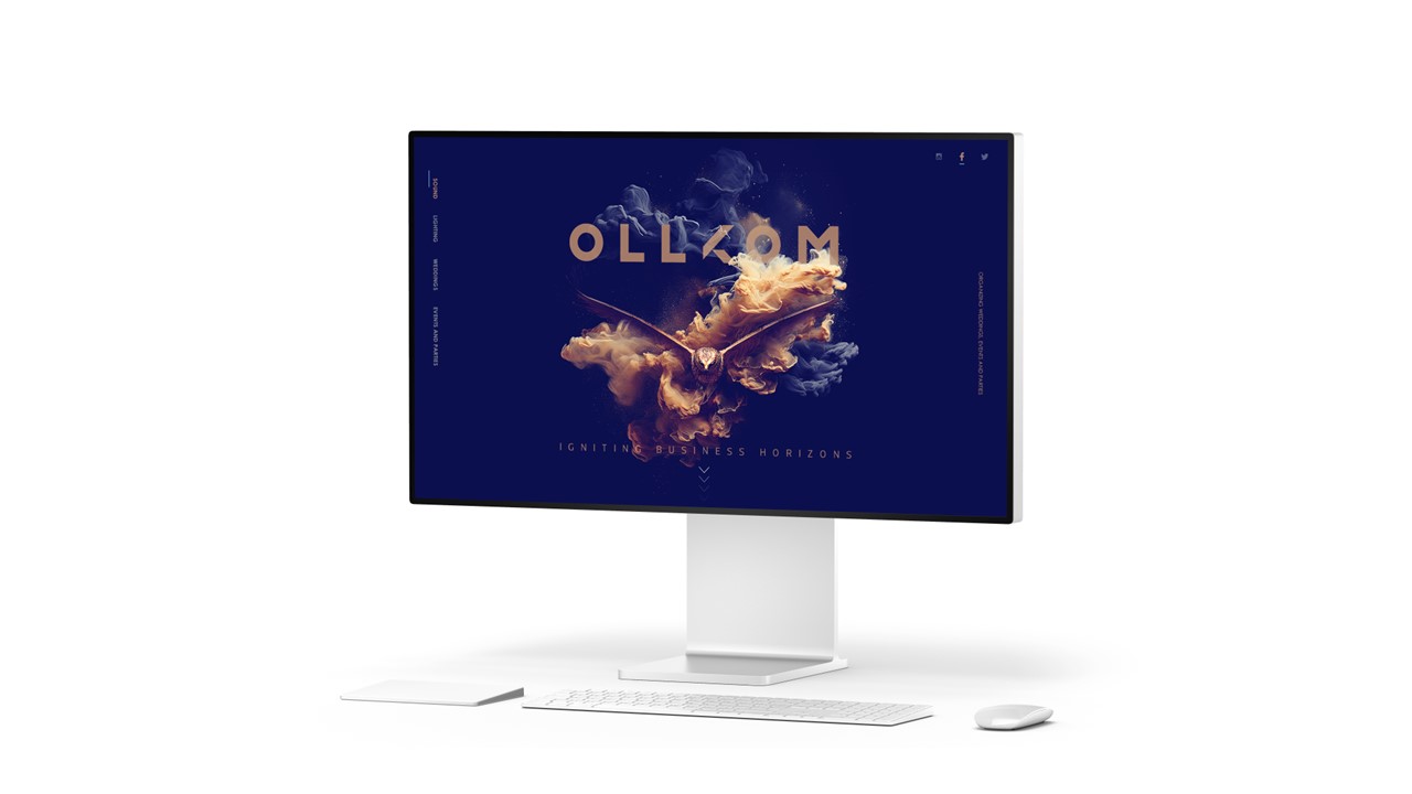
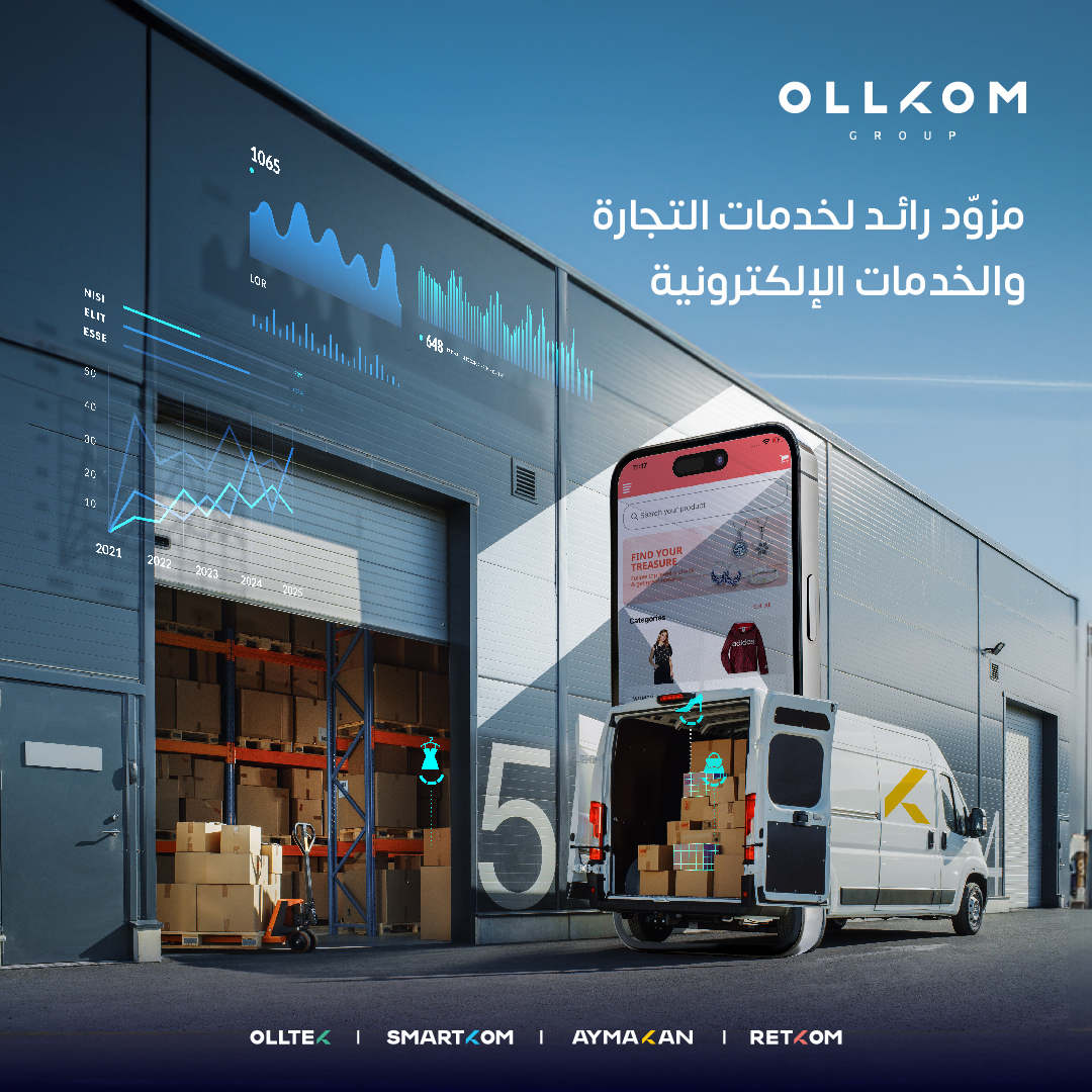
The logo features a refined color palette with dark blue and gold as the primary colors, supported by gray and light blue as secondary hues. These choices lend the brand an air of sophistication and opulence, evoking feelings of trust, professionalism, and exclusivity. The enhanced visual identity strengthens OLLKOM Group's positioning as a premium partner for businesses seeking top-tier services in logistics, ecommerce, advertising, and social media, reinforcing its appeal as a trusted and prestigious brand in its industry.






If you are interested in a new project, collaboration, or a reason to get a coffee don't hesitate to shoot me an email or use the channel in the footer below.